
Case Study Design
UI UX Design 2025


UIDAI
Website Redesign

2
1
1
About UIDAI
Objective of the Redesign
Problem Statement
User Personas
The Unique Identification Authority of India (UIDAI) is a statutory authority under the Government of India,
responsible for issuing Aadhaar, a 12-digit unique identity number to residents of India. The UIDAI website is the primary digital platform that allows citizens to enroll, update, and access Aadhaar-related services.
The goal was to enhance usability, accessibility, and user trust for a platform accessed by over a billion citizens. The existing design was functional but outdated, overwhelming, and not user-friendly, especially on mobile and for non-tech-savvy users.
Despite offering all key Aadhaar services, the UIDAI website:


Simplify access to top services
Improve mobile and desktop experience
Reduce friction in form interactions and downloads
Establish a trustworthy and consistent digital identity
Efficiently update Aadhaar detail for himself and his family.
Quickly search and verify Aadhaar information for students.
Overwhelmed by the cluttered homepage layout.
Struggles with inconsistent link behaviors.
Dislikes navigating through multiple tabs for related services.
Finds it difficult to view and download documents clearly.
Quickly download Aadhaar cards and check status updates.
Perform secure e-KYC verification efficiently.
Enrol for Aadhaar
Update demographic/biometric details
Download e-Aadhaar
Check Aadhaar status
Locate Aadhaar Enrolment/Update Centres
Lock/Unlock Aadhaar biometric information
mAadhaar App download
Key objectives included:
Rajesh Iyer
Meenakshi Sharma
About
About
Age and Location: 34 / Bengaluru
Age and Location: 45 / Jaipur, Rajasthan
Occupation: Finance Manager
Occupation: School Administrator
Device: Desktop
Device: Desktop (Chrome)
Primary Use: Managing Aadhaar services for
his family.
Primary Use: Verifying student Aadhaar details.
Key Uses of the UIDAI Website:

Had cluttered and overwhelming homepage content.
Failed to support multi-user or guided workflows, especially for family use.
Used inconsistent visual styles and technical language.
Was not optimized for mobile or accessibility.
Lacked a clear hierarchy and task-focused flow.
Problem 1
Problem 5
Problem 4
Problem 3
Problem 2

Redesigned homepage with priority cards for top actions (e.g., Update Aadhaar, Download Aadhaar)
Optimized for desktop and mobile use, using responsive layouts.
Introduced a cleaner navigation structure with service categories.
Embedded trust elements like security badges, verification indicators, and simplified content language.
Added contextual help, tooltips, and progress feedback during form interactions.
Bilingual support and GIGW-compliant accessibility features.
Solution
Solution

Solution Provided
UI Flaws
Goals
Goals
Challenges
Challenges


2
1
1
About UIDAI
Objective of the Redesign
Problem Statement
User Personas
The Unique Identification Authority of India (UIDAI) is a statutory authority under the Government of India,
responsible for issuing Aadhaar, a 12-digit unique identity number to residents of India. The UIDAI website is the primary digital platform that allows citizens to enroll, update, and access Aadhaar-related services.
The goal was to enhance usability, accessibility, and user trust for a platform accessed by over a billion citizens. The existing design was functional but outdated, overwhelming, and not user-friendly, especially on mobile and for non-tech-savvy users.
Despite offering all key Aadhaar services, the UIDAI website:
Simplify access to top services
Improve mobile and desktop experience
Reduce friction in form interactions and downloads
Establish a trustworthy and consistent digital identity
Efficiently update Aadhaar detail for himself and his family.
Quickly search and verify Aadhaar information for students.
Overwhelmed by the cluttered homepage layout.
Struggles with inconsistent link behaviors.
Dislikes navigating through multiple tabs for related services.
Finds it difficult to view and download documents clearly.
Quickly download Aadhaar cards and check status updates.
Perform secure e-KYC verification efficiently.
Enrol for Aadhaar
Update demographic/biometric details
Download e-Aadhaar
Check Aadhaar status
Locate Aadhaar Enrolment/Update Centres
Lock/Unlock Aadhaar biometric information
mAadhaar App download
Key objectives included:
Rajesh Iyer
Meenakshi Sharma
About
About
Age and Location: 34 / Bengaluru
Age and Location: 45 / Jaipur, Rajasthan
Occupation: Finance Manager
Occupation: School Administrator
Device: Desktop
Device: Desktop (Chrome)
Primary Use: Managing Aadhaar services for
his family.
Primary Use: Verifying student Aadhaar details.
Key Uses of the UIDAI Website:
Had cluttered and overwhelming homepage content.
Failed to support multi-user or guided workflows, especially for family use.
Used inconsistent visual styles and technical language.
Was not optimized for mobile or accessibility.
Lacked a clear hierarchy and task-focused flow.
Problem 1
Problem 5
Problem 4
Problem 3
Problem 2
Redesigned homepage with priority cards for top actions (e.g., Update Aadhaar, Download Aadhaar)
Optimized for desktop and mobile use, using responsive layouts.
Introduced a cleaner navigation structure with service categories.
Embedded trust elements like security badges, verification indicators, and simplified content language.
Added contextual help, tooltips, and progress feedback during form interactions.
Bilingual support and GIGW-compliant accessibility features.
Solution
Solution
Solution Provided
UI Flaws
Goals
Goals
Challenges
Challenges
1
2
4
6
3
5
UI Flaws in the Previous Homepage (Audit Findings)
Visual Clarity
Navigation
Accessibility
Visibility of System Status
Affordable
Language Localization
Information Architecture
UI Flaws

Homepage overcrowded with banners, tiles, and links.
Key services buried under unrelated menu items .
Low contract between text and background in some sections; poor screen reader compatibility.
important notifications (e.g., deadlines, services downtimes) aren't highlighted or placed prominently - users can easily miss them.
Button and links do not visually indicate interactivity (e.g., “More Details” looks identical to content).
Language toggle is not prominent; translated version have UI breaking issues.
No clear prioritization of content; primary services are hidden below-the-fold.


Website Redesign
Key Improvements
UIDAI Website Redesign
Floating Accessibility Toolbar
Floating Notification Drawer
Introduced a floating accessibility menu to enhance usability for people with diverse needs. It includes features like screen reader support, text resizing, dyslexia-friendly fonts, high contrast mode, and a language switcher. Users can customize their experience without navigating away from the page. This promotes inclusivity, improves accessibility compliance, and builds user trust. The reset option allows users to easily revert to default settings. Overall, it ensures the platform is more welcoming and usable for all.
A floating notification drawer was implemented to provide users with timely updates without disrupting their browsing experience. It displays important alerts like awareness campaigns, official messages, and developer updates. The drawer can be accessed or dismissed easily, ensuring information is visible yet non-intrusive.


Key Improvements
Key Improvements in the Revised UIDAI Homepage
Hero banner is simplified and focused on one CTA — "Update your Aadhaar..." — reducing visual overload.
Unified button styles (“More Details”) and link behavior.
Design appears modular and grid-based — should scale better on mobile.
The top banner now serves as the primary place for updates — likely dynamic or rotatable.
Optimized for desktop and mobile use, using responsive layouts.
Language toggle is visible in the top-right, ensuring accessibility.
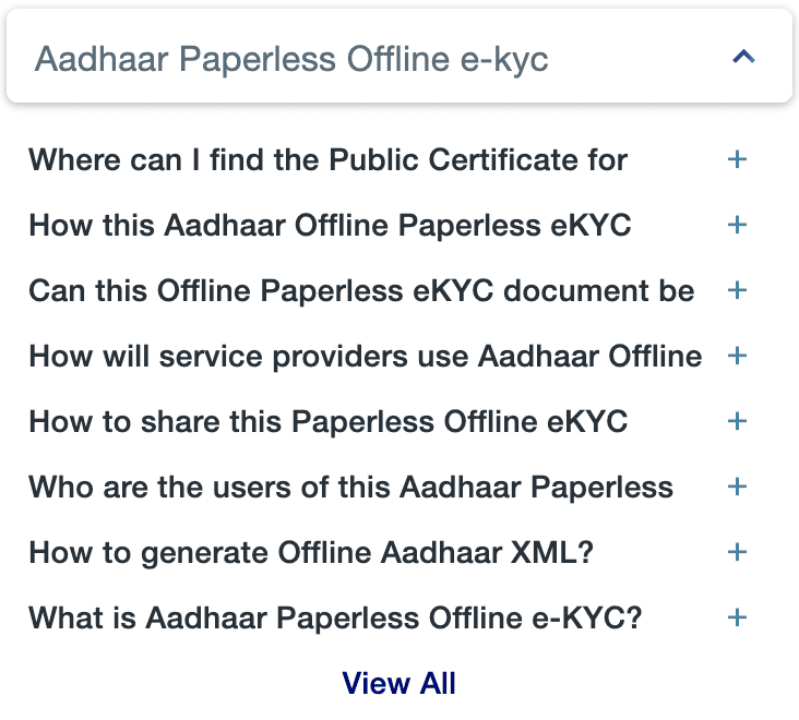
FAQ section provides collapsible answers directly on homepage — reducing clicks.
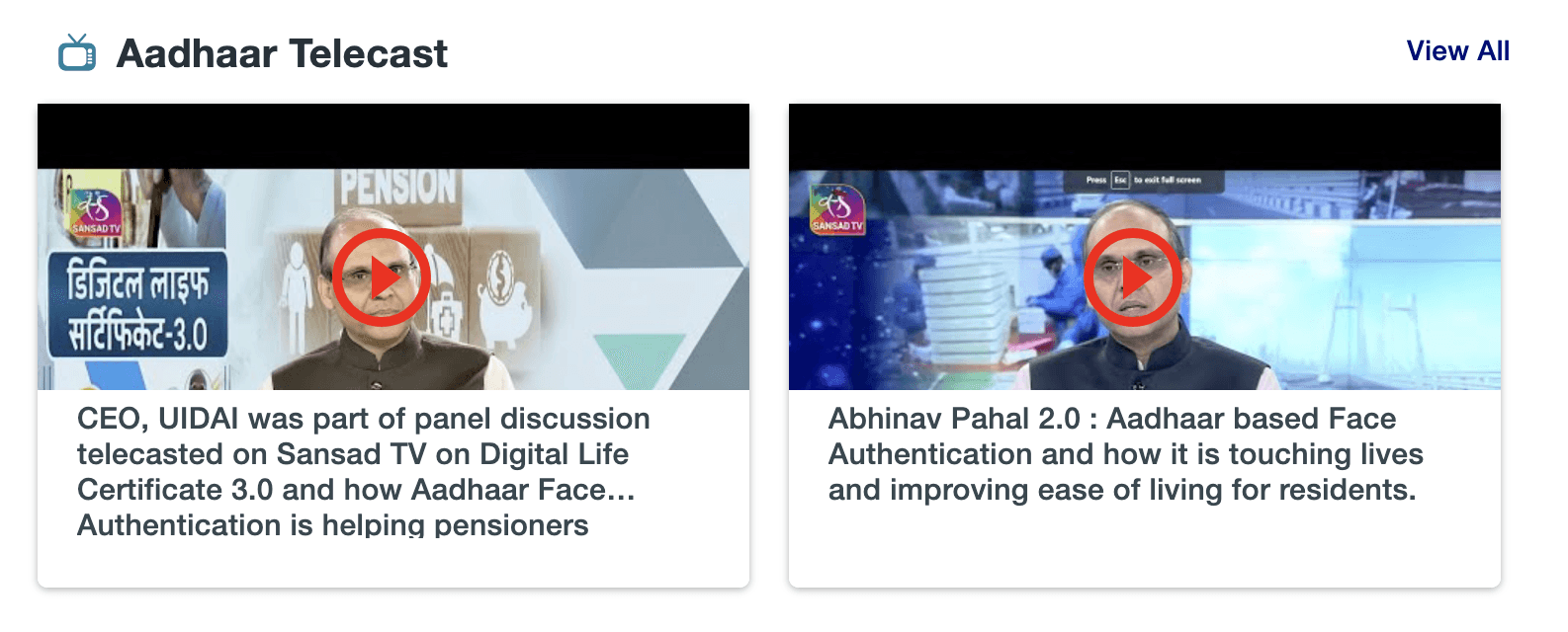
Media Coverage cards add credibility.
Clear sectioning (Aadhaar Services, Media Coverage, FAQs, App Promotion) with proper whitespace between them.
Typography and card design are consistent across modules.
Larger tap targets and touch-friendly elements (e.g., accordion in FAQ section).
Visual priority given to alerts compared to previous clutter.
Embedded trust elements like security badges, verification indicators, and simplified content language.
Multilingual design support likely improved (though you'd test this with translated versions).
Clear, active CTAs like “Download” and “View Dashboard” give better user direction.
“Aadhaar in Numbers” gives transparency and trust signals.
Forms and status feedback (if implemented) will improve trust.
App promotion and download section is engaging and modern.
Visual hierarchy established using large headings, iconography, and consistent image sizes.
Uniform iconography and spacing.
Bilingual support and GIGW-compliant accessibility features.
Visual Clarity & Hierarchy
Consistency
Mobile Responsiveness
Notifications Handling
Navigation & Information Architecture
Language & Localization
User Assistance & Feedback
Media Coverage cards add credibility.
1
3
5
7
2
4
6
8
Conclusion


Below is my conclusion
Transformed a complex government platform into a clean, user-friendly experience.
Resolved major usability issues like cluttered layout, poor navigation, and lack of accessibility.
Improved service discoverability and visual hierarchy with a modular, card-based layout.
Ensured mobile responsiveness and multilingual support for diverse user groups.
Integrated accessibility features (WCAG compliant), benefiting senior citizens and users with disabilities.
Built user trust through transparency (e.g., “Aadhaar in Numbers”) and simplified CTAs.
Established a scalable, future-proof design that can evolve with user needs.
Positioned UIDAI’s digital presence as inclusive, efficient, and citizen-first.
1
2
3
4
5
6
7
8
Thanks for watching